OUR LOGO
Interpretation of the designer, Samantha Puth:
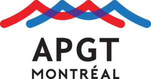
Designer Samantha Puth, from Okay Design, reimagined the shape of the Jacques-Cartier bridge to subtly evoke the “M” of Montréal. The curves of the bridge have been doubled and superimposed, thus recalling the motion of the waves on the St. Lawrence river, an icon of Montréal.
The red, official colour of the city, gives the logo its punch. Where red and blue mix, purple appears. These three colours are found on the floral emblems of the city’s flag.
The logo is lively, dynamic and youthful.
INTERPRETATION OF THE 2020 ADMINISTRATION:
In addition to the reasons mentioned by the designer, we chose this logo because it features a warm colour for summer and a cool colour for winter. The blue recalls the French-speaking community, the red evokes the English-speaking community and the purple represents all the other cultural communities of the city.
Montréal is only accessible by bridge. The river and the rapids determined the city’s location.
The bridge is also a strong symbol of the city, representing the connections we make daily, not only within the tourist industry but also among the citizens.


